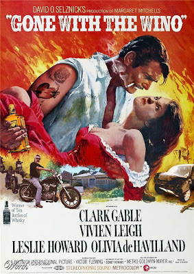
From the introduction of Worth 1000´s latest photoshop contest:
It's not easy being a professional graphic designer. Often they're asked to create a movie poster with nothing more to go on than the title. And if the email has a typo in it, things get even more confusing. All it takes is one wrong letter to really foul things up. You should have seen the posters they first designed for "Snakes on a Plate", "A Fight at the Opera", and "Mobster House"! (We won't discuss the original poster for "Tucker"... )
The rules of this contest were: take a popular movie and swap one and only one letter of its title OR add or subtract one and only one letter of its title.
Some of these are very funny and clever, thanks to the fact that the English language has so many words that actually work. These are only 4 from 53! click posters for full cinemascope experience.
2009-03-14
Con Hair
Subscribe to:
Post Comments (Atom)
No comments:
Post a Comment